20 years back. I just got reminded by a friend, I had already missed it.
Before, it was always “co-located” space. Thanks to Jens (a good friend ever since) and support by Yves Weisselberger, CEO of KDS (my employer back then), I took control of my Internet.
Does make me wonder, who remembers that milestone… And that first logo. Where I painted a “calligraphy”-like computer with a digital airplane, reflecting my conviction that aviation goes digital. Learning Logo-Design rules: Color. Font. Scalability. Too often confronted with logos failing on one of those at least. i.e. dark background? Browser-bar icon (favicon)?
Triggered Thoughts
First Webpage 1994 (thanks to Oliver Dietzel). First own domain (CheckIn.com) 1995. First commercial Internet travel bookings (ab)using Amadeus 1996 (Siemens Travel Net/Cytric). Honorary Member of the Editorial Board for ITB Travel Technology Congress 1999-2002. Exclusive speaker at the first ever ACTE event (a three-city roadshow) in Germany 2001.
First work on climate-neutral aviation 2008. Airport Ops, disruption and deicing management 2012.
Working on Regional Aviation Startups, due diligences, learning the faults, developing an idea that ultimately lead to Kolibri.
And So Many People I Owe
There was so much more, friends I met, friends moving to other realms. Friends, mentors staying friends. Almuth. Colleen. Regina. Hans. Jerry. Richard. Ted. Anne-Marie. Jutta. Christoph. Werner. Bego. Petra. Christianna. Heinz. Mike. Andreas. Karin. Nicole. Grant. Sean. Another Heinz. Another Mike. Ben. Joergen. Olli. Jens. Susanne. Judith. Uwe. Urs. Etienne. Ndrec. Octavian. So many (and so many others) having such a lasting impact on my live. So many added constantly. So many people I owe. And some other’s I could help. Sarah or Stephanie jumping to mind.
So many others I lost track. So many gone already. But none forgotten. So many social networks helped me to keep track or recover after many years.
Almost three years since our launch, we could not make CheckIn.com a full scale business.
https://www.youtube.com/watch?v=-Na_fkD7cDg
We knew that targeting airports would not justify the development and were confirmed – airline use is more than 10 times of what airports use our tool. Unfortunately, the majority use is access to our free data. Approaching the existing users, they have no money for such information, though they confirm the value in their day-to-day life. Even a SVP Network Development of a large airline, praising me for the unique value of our tool, knowing from the analysis we keep maintaining for him, that many airports use false “facts” for their catchment areas, confirms he compares with our data as an indicator to the quality of the airport data.
But nevertheless he expects the airports to deliver the (biased) information. “In the end, it’s a look in the Crystal Ball”. Expressing the fact that he does not understand the value of good data, even for the look into that Crystal Ball. Garbage in – garbage out.
Unfortunately, only the network departments of the smaller airlines frequently access our airports, but we suffered some painful losses on the larger airlines of which two have started to use our data. The large airline having recently expressed some interest and receiving some “combined” analyses, now having turned down the discounted flat offer we made. Such we decided to unregister the company and run it as a personal side business only. Yulia takes care of that, I will focus on other projects and only help on demand.
If you need know how in airlines, airports, specifically corporate strategy, marketing and distribution, disruption management you might want to talk to me…
The last weeks were rather challenging. Speaking at Passenger Terminal Expo on Data Silos, Silo Thinking and the need to Tear Down the Walls, Yulia and I also worked on the update of the airport passenger statistics, adding movements to the database to expand our information. And we fell right back into The Numbers Game trap.
The main Key Performance Indicator (KPI), the value that reflects the “importance” of the airport, is the passenger numbers. All other KPIs, like movements, on-time-performance, revenue are scondary. Where I can understand that airports publish preliminary numbers for the press, those numbers are then updated and finalized. By that time, they reach Eurostat, national statistics, Wikipedia, ANNA.aero, Airports Council International (ACI), IATA and other official bodies. How do you define “Total Passengers”?
But then we go back to the airport’s monthly and annual passenger numbers. And to give examples that really bugged me the past weeks.
A worse case: No codes, different sortation, wrong numbers.
Spanish AENAhad what I understood an error in their May-data. The numbers are three to four times above the average. And their own annual numbers confirm it, being about that difference too high. If I’d be lazy, I would simply correct the May numbers so the annual total matches the total given by AENA. But is that the error? Working professionally, I informed AENA (airline marketing). Matter of fact, as the airline, I’d be embarrassed and would make sure those numbers to be updated immediately. After one month of no reply, I inquired. Both verbal (phone) and e-Mail. The response was a “blame game”, I shall contact the statistics group at AENA. Excuse me? That’s your understanding of customer support? Are they unable to clear that internally, bothering the customer with the internal (bureaucratic) hierarchy? The following week, the numbers were still not updated. Now, that is embarrassing. So the fact is, I do “unprofessionally” and assume the mistake, as the data owner neglects the issue. Again. Main KPI.
And their tables? Monthly data split to 12 tables, available as Excel without the airport code. Why again do they provide “Excel”-format? Not for quick data-exchange, that’s for sure. The day after I wrote this blog, AENA finally identified the “error” on the data. While all other files showed the current month’s data, the may file was set to show the accumulated data Jan to May. Nevertheless this though being just a “forced error” and not a real data issue, it proves my point that it’s enforcing errors if you split the data into tables. And it does not change that the different subtables in those same Excel sheets are sorted by “totals” instead of airports, such you got to re-sort. And spend time associating the IATA codes to the airports.
ANNA.aero maintains what they call the European Airport Traffic Trends “Database”. Now in order to make sure we have all airports’ data that publish monthly numbers, I imported the data into our database and compared. And instantly ran into trouble. Because for i.e. France, more than half the airports’ monthly data does not sum up to ANNA.aero’s annual total. As such, the data must be disqualified for professional use! Interesting, three French airports responded to Yulia’s inquiry for official numbers to use ANNA.aero’s numbers. All three airports being ones where the total does not compute.
ZRH-BUD route level data. We wonder, why we have four different values for the route Zurich-Budapest for out- andinbound passengers. Two of them by the respective airports. Two courtesy by “official data providers”. Different numbers on a single given route?? So we find ourselves at a loss, we likely won’t use them. Not just for Zürich oder Budapest, but that is just an example! We happen to wonder, how Eurostat can compile passengers, flights and seats and, when the airports say they don’t report such numbers.
We find several sources for public accessible data. Sometimes you find it on the airport’s own website, somewhere in “Statistics”, sometimes in a press release, usually not in one, but in 12 press releases (see image). And even when publishing the annual numbers in one file, the file comes as a PDF, formatted that they cannot be extracted into a table but copy into one value a line. On a complex table, that renders that useless. So the airport forces users of their data to write the data off the PDF? You can’t be serious, can you?? Sometimes national airport associations publish the data, usually monthly. After we found them to occasionally change the formatting and order even within a given year, we double-check that on the import, burning valuable time. Then we learned to now download monthly data before the annual one was available, as we also happened to fall the trap of intermittent changes (see ANNA.aero). Many such files do not contain the airport codes. But the airport name in the national language. Upper case. No, that does not compute easily and is prone to cause data errors.
Even where Excel is being provided (like by AENA), the files are not ready for instant import, very often missing the unique IATA airport code that would allow to properly associate – but usually airport names in national and uncommon naming, requiring additional work to add the three letter codes to allow for proper import. And then you have those cases, where the monthly numbers do not sum up to the annual totals.
All in all, that shows the neglect airport managers handle “numbers”. Given that we all talk about e-Commerce for 20 years now and for 20+ years I keep addressing the data quality as an issue. Before the internet, airports published their data in the format they now provide by PDF. For journalists or other data providers to type them off. They simply moved the paper to the PDF, being a print format, not a data exchange format. They obviously did and do not understand that times have changed. Keeping with the times, they should maintain and publish the data in ways that they can be pulled using an HTML-call (returning a given-format CSV), if that is not possible, they should at least use an Excel file. If they change data, they should inform the data users about that. But nothing at all shows the modified file (rev.1, v.1), so in case of a discrepancy they enforce a check of all monthly files. Again, we talk about their main KPIs, something they should be interested to make sure that everyone uses the “right” number.
Catchment Area Case Study
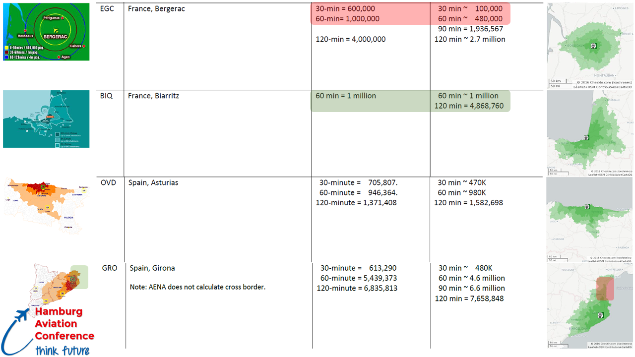
Based on our (constantly expanding) catchment area case study about the numbers given by the airports, we understand the concerns, disbelief and rejection of such airport numbers by airlines. As any quick check from other sources (like our free isochrone analyses) unmasks them as useless, guesstimates or even intentionally beautified. I confronted Fraport Bulgaria with their given numbers in a brochure I picked up at ITB Berlin, being 2.3 to 2.5 times, or in percent 230 to 250% above our sound, European-wide calculations. Initially, they backed off, not knowing of the brochure, so I forwarded them photos of it. Then they referred to “drive time offsets”, neglecting the fact that we have comparisons on a European scale and even giving extremely ambitious drive speeds, that calculates to 10, 20% offset at the maximum on the population reach, but not to 230 or 250 percent! So instead of taking this up professionally, their managers decided to stick their head in the sand.
Passenger Terminal Expo 2017
Speaking at Passenger Terminal Expo in the Management & Operations track (speaker notes here), I challenged my audience about Data Silos, Silo Thinking and the need to Tear Down the Walls. It addressed A-CDM and why A-CDM rather usually gets stuck in the early stage of the process. Silo Thinking and not invented here being the most common cause as all my friends in the A-CDM arena tell me. The same being true for airport managers. And an airport general manger told me: “If we don’t embrace that we got to exchange our data, we miss to do our job”. I was sorry I had to tell him his airport being one I don’t have the passenger data for yet.
Brand Management
Another Post Scriptum: These weeks, another several faces left our industry, another “trusted face” leaving UBM. Some few remaining in aviation at least, others move on to other industries, others again (like myself) struggle to keep in our industry.
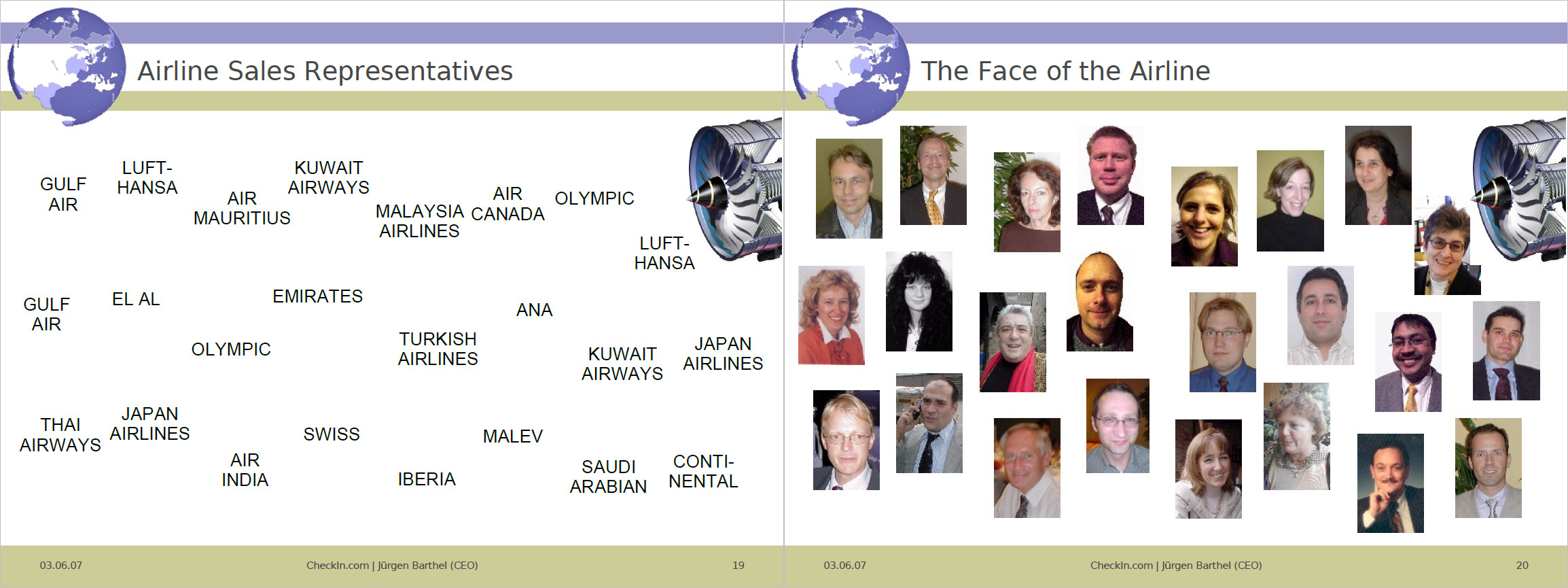
Ever since I started addressing “Airline Sales & e-Commerce” in 1994″ at the Airline Sales Representatives Association (ASRA), I emphasized the importance of the “face to the customer”. A Logo, a face are things, users attachthemselves to emotionally! It’s your emotional USP. Customers (“contemporary” B2B, B2C) knowing someone in the company attach themselves to it. That is not all, sure. Prices for example must still be competitive But not ultra-low. Reputation of the company can (and does) outweigh the price. But also the person you know there usually has an impact to who you make business with.
This is an example from 2007, explaining it to the ASRA members. Unfortunately, they proved they did not understand it. Neither the need as usually well paid Sales Managers to embrace the “new sales channels”; in most airlines the “traditional Sales” and “Social Media” are different divisions. Some airlines more recently trying to bring together what’s meant to be together, usually at the expense of the “old faces”. Nor did my ASRA fellows understand the importance of networking, the group fell apart two years ago and is meanwhile unregistered.
And let’s not go into brand management here, I addressed the idiocy to rename and kill brand identification often enough.
“New Airline” Business Concept
In the last weeks, I got approached about investors being interested to invest into aircraft, seeking which business model to use. The initial idea was Airbus A320 or Boeing 737, leasing that to the low-cost airlines. As if we wouldn’t have a record on the order books, long delivery times and the low cost airlines recently leasing their aircraft to other airlines as they find it increasingly difficult to find new routes. So I came up with a completely new model, quickly qualified numbers and viability and offered it to them. The intended aircraft maker learning about the idea took it up.
Friends I introduced the business concept to, in order to qualify it and get questions about the viability answered wondered why no-one has established such a model yet. I think that takes a little hammer. Or some out-of-the-box thinking.
Working on that concept and following up on Passenger Terminal Expo, also about my rather negative experience with HR and head hunters a discussion arose about a shortcoming of our business culture:
Narrow-Minded Management
We mostly agreed, that most managers today encourage a narrow-minded thinking. This is your job, don’t you bother about the jobs that are managed in other departments. If you do in fact think outside the box, you challenge such managers.
Mark from OAG directed my attention this week on OAG’s Punctuality League, which they offer for free download and compiled the results in a “dashboard”, though I find that exceptionally unintuitive and more confusing than helping. FlightStats offers a similar information in tables and graphs I find far more intuitive, the On-Time Performance Awards.
Now after a quick first look, it shows already that it’s incompatible.
I just look at the first OAG graph “Top 20 Airlines by LCCs/Mainline Airlines”.
Hawaiian Airlines (89.87%)
Copa Airlines (88.75%)
KLM (87.89%)
and compare to FlightStats, where Hawaiian neither shows in the Top 10 International Airlines nor Major Airlines (neither Mainline nor Network), but only Top 1 on Regional Airlines. KLM is 1st on International Network flights and 4th on mainline flights.
When I first encountered the FlightStats monthly statistics for airlines and airports, I’ve contacted them (with no reply) if I may add that as an indicator to our airport data. As I consider that valuable information for aviation network planners.
But as I stumble immediately over differences, it raises question. Such, it might be a good idea if OAG and FlightStats talk to each other to make sure they use the same data, and logic before they dig into detail. Or that they explain how they value the data and interpret it. As is, there are unexplained differences. Sorry, now I distrust both sources…?
Indicator. Indicator?
It can only be an indicator, as both sources fail to relate the one to the other. My first question would be to correlate the on-time performance to the hub airlines. Because it is utterly unfair to blame an airport, if their major hub airline is notoriously late.
Then one shall also keep the size of an airport and it’s congestions in mind, i.e. British Airways suffering from congestions in London-Heathrow or Thai Airways in Bangkok. Who is cause? Who is victim?
Yes, for CheckIn.com we emphasize that all that data can only be indicators. To be interpreted by an experienced network planner. Because a single new flight makes a major impact on a new or small airport, but has little statistical relevance on a major hub. Saying that, isochrones are in itself valuable statistical data and we put them into our analyses for a reason. As they are a necessity in comparison with the catchment area analysis to interpret the possible impact for a route. In forecasting, you work with indicators, you have no facts.
Big Data – Big Trouble
At the same time you work with big data, so the more data you work with, the more vital it is to get them from a sound source and have them integrated into a common system. Whereas most established data providers, be it OAG, Flight Stats, SITA, etc. have not yet addressed that for a “good reason”. But as an industry, it is vitalwe add this and integration is very high on our back log at CheckIn.com of what we where we want to go!
For the time being, national statistics differ from Eurostats, differ from aviation industry statistics, differ from common sources. These differences in data you get from FlightStats and OAG just being an example that this is also an issue in aviation. Who’s right? I even have examples where the numbers figure within an airport’s own website for a given year. In order to improve, we got to tear down the walls! And yes, that’s part of what I will talk about at coming Passenger Terminal Conference & Expo in March. Will you be there? Please let us meet!
Rotational Impact
So. Why do I give these on-time-performance, no those delay statistics so much thought? Aside the cost of delays summing up to millions, they are not just a nuisance, but a problem. Because when I did that additional case study on cost savings, based on the Zurich Airport’s deicing I did for SAE G12 and WinterOps.ca, I learned an important fact from Swiss (the airline). Whereas the passengers impacted by the immediate flight understand the problem and accept higher force, the aircraft is not operating a single flight, but an entire rotation (a chain of flights) during the day/week. Any major delay has a rippling effect in the network. And if you have a snow-caused delay in the morning in Zurich, your passengers on the evening flight from the Mediterranean summer vacation will not understand and file for compensation. And the airline usually pays!
And for network planning, it is vital to know if you have to build in (expensive) buffers into your schedule, to cover up for the potential delays. That means your aircraft and especially crews are not airborne as much as they could be, such causing further loss of revenue. There is a very good reason airlines increasingly add clauses in the handling contracts with the airports punishing for creating delays and rewarding for reducing such. Being said to be an expert in winter ops planning, it’s bad enough about technical or natural (weather) delays. But yes, delays are also caused by aviation management, be it handling agent, airline operations or air traffic control.
A Summary…
So what now. I think the availability of delay statistics is compelling, useful and needed. But take them with care, as you take all statistics. Try to understand how they are computed, the logic behind and ask your provider accordingly. Yes, that includes our own. That’s why we publish the CheckIn.com methodology. Only if you understand it, you can yourself interpret it. Trust it.
We got to understand in our industry the value of data and common data structures. A delay is a delay? Nonsense. As I mentioned back three years ago in the article about A-CDM.
And I distrust any “closed source” company that does not provide me with their methodology on their analyses. Like many airports do. On the other side, at CheckIn.com, the value is not really the methodology (which is sound), it’s the work that is behind it, the compilation of data from different sources, the constant improvements we give that. Only given sound data, we can provide quality analyses. Given the quality data, anyone can come up with more or less professional analyses. Even to come up with the calculations we do to calculate an airport’s impact on a traveler’s likeliness to choose the one or other airport can be replicated. Though no, we don’t explain in detail how we do it, but the general concept. The hard work we spend every day to merge data from different sources, to cover for mistakes and other short-comings – that makes our work so hard to copy… And is a main part of our USP (Unique Selling Proposition), what makes us “unique”.
LinkedIn makes it to my personal blog for three reasons this week. The LinkedIn ban in Russia, the naming of our LinkedIn Group and our experience with LinkedIn promotions of our posts.
I also add a note about why we give away Isochrones for free, but call ourselves “The Isochrones People”.
LinkedIn Ban in Russia
As much as it is a “political signal”, one must keep in mind that the rules were long known and other companies invested big money in Russia to store the personal data of Russian users in-country. Further, German and European Data Watchdogs (Datenschutzbeauftragte) also demand storage of that data in Europe (mostly a reason for big data centers built and used in Dublin).
As we are in preparations at CheckIn.com to add Russia (on demand by an airline customer), we added a new blog ad hoc to our page (not yet in our look-and-feel) to promote what we initially started using LinkedIn for. Though that already was on the back-log of things to do, relating to the LinkedIn promotions we address below.
LinkedIn CheckIn.com Group
A few weeks ago we created a group on LinkedIn to address the non-commercial side of the business of analyzing catchment areas, things like isochrones or why travelers choose an airport against other airports. Distance is just one reason, reputation (both airport and airline), prices and frequency. Commercial and personal relations (VFR, visiting friends and relatives) and tourism can influence the decision of the travelers to choose an airport over the other(s). Where we identified an average of 10 airports being competitive to other airports in Europe and five usually having an impact on travelers, studies say that people usually look at one airport as “their” airport with maximum of two others as “options”.
That’s what we won’t discuss as “news” on a commercial level, they are to frequent to discuss on my personal blog, they are neither focused on airline network development (but part of it like MIDT). So I decided that we set up a group and I looked at other commercial-interest groups. I could have set up “Catchment Area” or “Isochrones”, but that way may have attracted people from other industries and I wanted to keep an aviation focus to the group. So I decided to name it CheckIn.com. In the long run, we may rename it to CheckIn.org revitalizing the respective website with a good cause that is currently still hosting the Airline Sales Representative Association that broke up and disbanded 2015.
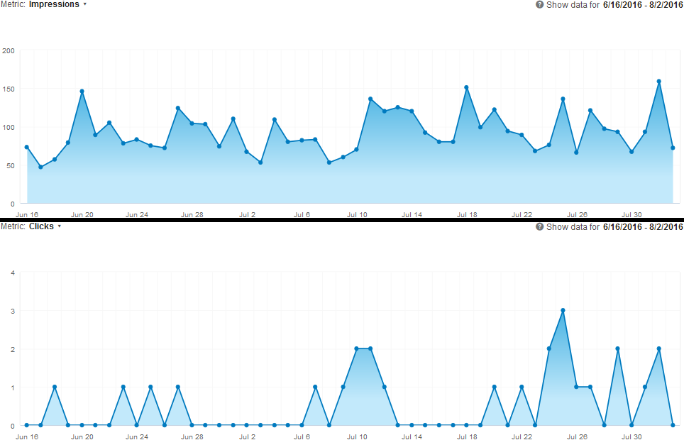
As it happens, I have been a long-year supporter of LinkedIn, I do love the social networks for keeping in touch with people I know and value. I only confirm links on my social networks to people I have a relation to, be it personal (mostly Facebook) or business (mostly LinkedIn). I liked the groups on LinkedIn and the company profiles, even decided to set up a LinkedIn company page to promote our news – and a group for the stuff that’s not commercially driven. But in the past months since, I found posting on LinkedIn outside my own profile not to make much sense, neither professional, nor personal. In average, less than 10% of my network react on my posts – and that’s mostly the same people.
At the same time, any article I write here on my personal blog is being read and results in more responses (though mostly personal, not on the blog) than any LinkedIn post. And on the example of this year’s mostly accessed post on Purchasing Power & Airports last March, that one even in the past month showed as the top post by 482% to the next best one, The Numbers Game. Almost 5 times more for the Purchasing Power. Seems it is being spread on channels beyond my own “control”. Which is what social networking is all about.
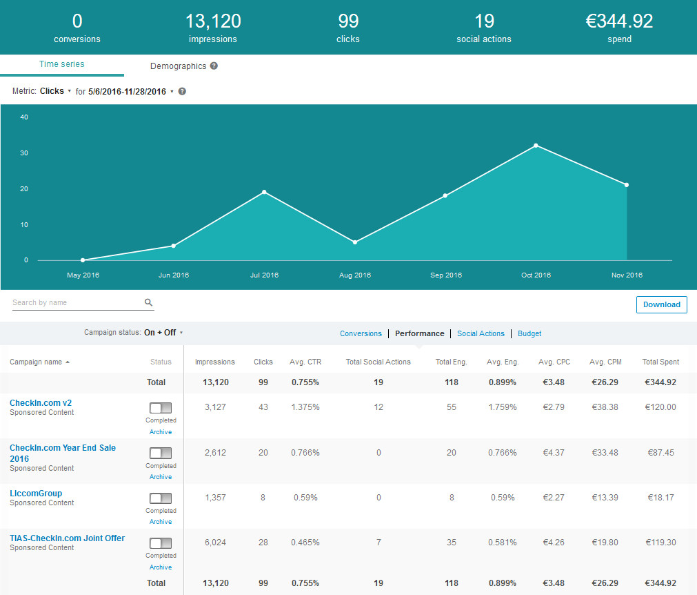
We did a promo for our company page and our group (click on the graph to see it real size). Where the group does not have the commercial focus! We have 10 members on the group, we have 51 followers on the company page on LinkedIn. Out of … how many contacts I have from events like Routes or Connect who I consider that they should be more interested in the issue? Out of those, how many have registered on our website? It’s free. It gives a very clear value: Free Isochrone Map and Facts! And even with some new followers, still the majority of users on our company profile did not register on our website.
I mailed my contacts directly (personally) with a prepared mail text (using poMMo, which I also use for many years for other such updates like the birth of my daughters). Interesting enough, about every airport I talked to keeps telling me excuses and that they “will register”. We’re not talking to buy the more complex analysis, we talk about a simply, free registration to access the incredible amount of data we provide for free. Airlines are more active than them. About any airline I so far contacted in Europe has registered. And uses the data. And the first order analyses and they support actively asking pointed questions, especially about the route level analysis we are having in development. But they take what we have now, which we believe to be more likely of interest for airports. Interesting there also: For some reason my contacts I know best and considered “save” mostly have not yet even registered. But people I know just a bit, they come and show interest. And invest. And invest again. So they like what they get, they understand the value, my “friends” obviously don’t.
Worse for LinkedIn, even on articles posted (LinkedIn Pulse), they have a lifetime of max. 3-4 days, on blog and mail, we sometimes get response weeks later. On our blog, as for the example above, even months later, the unique visits are substantial!
And then the news hit, that LinkedIn has been banned from Russia. See above…
Need a Campaigner? Hire me!
So we decided this week that I add a blog to promote news directly on our website. We do collect ideas for a “version 2” of our website, so far we still invest. I keep looking for work as we can’t live of our work at CheckIn.com (yet) and all money goes into improvements. I will still support Yulia on CheckIn.com, but it’s her company. And we prefer to pay for developers, mapgicians and mathgenies… Anyway, side-tracked 😉
We did expect airports though to understand the insane quality they get for a fraction of what they paid so far for far less. We give the “classic” Isochrone Maps for free: As we outlined in the new News, we see them as insufficient basis for any decent route calculation. Over the next weeks, we will transfer the LinkedIn posts there and refer from LinkedIn to the posts on our own site.
The Isochrones People
A question that came up this week again, was why we promote that Isochrones are not Catchment Areas, but call ourselves The Isochrones People?
During pre-launch we learned that Isochrones and Catchment Area analysis are used as equal. Isochrones are also – and will remain – the basis for our analyses. Beyond the reach of the typical isochrones, in the background we calculate something like 6-8 hours “reach” for which we calculate drive times – beyond we go into “statistical noise”. But when we talked to our supporters from airports, airlines and consultancies about “The Catchment Area People” vs. “The Isochrones People”, there was immediate understanding what we’re doing on the latter one. And similar many questions about the first… Like “isn’t that the same?”
It’s a catch-phrase, people working in our industry shall identify as as the leading source for such information. And hey, we give them away for free, so yeah, I’m happy with being one of “The Isochrones People”.
It reminded me very much of my experience with A-CDM, where most larger airports’ IT rejects external solutions in order to build a custom-made solution. After several years of work, we have several tires (or tiers?) of different size, incompatible to build upon.
It’s the same argument I hear from many airports and airlines when talking to them about CheckIn.com.
It will take time (and interest) until they understand that it’s not just another “same”, but something fundamentally new.
Linus Torwalds, inventor if the Linux operating system said: “The NIH Syndrome is a Desease”
I think this time we got the numbers right … we just don’t know which ones to use.
Talking about CheckIn.com, we have been asked many times, how we crunch our numbers. Or that our drivetimes are different from Google. Yes?
The second question is rather important, as before you crunch the numbers, you got to see what you work with. And this article on LinkedIn by Jasper Venema rang a bell last week…
So let’s talk about statistics today.
Passengers
We are in the process to add some new region to CheckIn.com and as usual, the first and foremost figure we need are the passengers. We usually use Wikipedia, but even between different Wikipedia pages, more so even between different Wikipedia languages, we find different passenger figures. Now we usually compare them with commercial data we get and guess what: There’s official sources such as ACI, IATA, national statistics, airport associations, but also commercial sources like ANNA.aero, Albatross, AEX or others and in all cases, we have – sometimes substantial – discrepancies on annual passengers per year for a(ny) given airport…
So we started to ask the airports. And get again other numbers.
We know one difference, where an airport association doesn’t use the departures and arrivals, but simply doubles the departures they get. Not very contemporary and definitely not state-of-the-art, but yes, it explains some. Jasper Venema’s article explains some other. But in numbers we don’t much care about explanations. It should be in our industries own and vital interest to use the same number for the same “item” (here “total airport passengers for a given year”). And quite honestly: If the airline has different numbers as they don’t count non-ref passengers, so be it. With most airlines not happy to give out “their” numbers for a given airport or route, the number that counts is the one the airport publishes.
Drivetimes
Whereas we showed long time ago, that they differ from tool to tool. And sorry, Google is neither the best, nor the most accurate of those. We compared more than 20 different tools, from our initial logistics software used by trucking companies via Google, MapPoint, Maptitude, Apple, Here, … Today we mostly use OpenStreetMaps, as we found them on the tests we did in different countries and where other tools failed, they come up with the proper calculations. Even on ferries they are mostly accurate, where Microsoft and Google still translate long-haul ferries with Zero drivetime.
We cannot consider traffic jams, temporary construction sites or detours, but found OpenStreetMap to provide lower speed defaults on highways likely overloaded. We don’t know how fast you drive, but neither do Google, Bing & Co. – we got to work with assumptions.
Start + End Points
Another bug we have in our backlog and work on constantly (it’s “relax work”) are the city centers. We calculate population based on the municipality. Now municipality borders are nothing really easy to use for mapping. Take the example of Hamburg. For some reason, Hamburg “owns” a part of the North Sea. Such we had to modify our boundary data for Hamburg to exclude that intentionally as it caused questions on our default example and the map to be “off Hamburg”. Then you need a “geopoint”, a given geographical point defined by latitude and longitude. For many municipalities, there is such a point defined, usually called the “admin center”. But many municipalities either have not defined such point – or it’s a (stupid) “theoretical” centroid that does not relate to streets. Where missing, the drive time takes such computed centroid too, the center of the boundary. In many cases that results in a point somewhere inaccessible by road. There it takes the spatially next road, which does not have to be easily accessible or be well connected to the main roads. Or the centroid is too far off from any road.
Airports are also prime candiates. The geopoint to be used for navigation very often is not the terminal road, but the center of the main runway. The next road might also not be near the terminal, but on the other side of the airport. As such, for each and every of the airports in our database, we defined the geopoint at the terminal or closest to the terminal. For many smaller airports, there is no street data in any of the map tools we use, as those roads are managed “privately”.
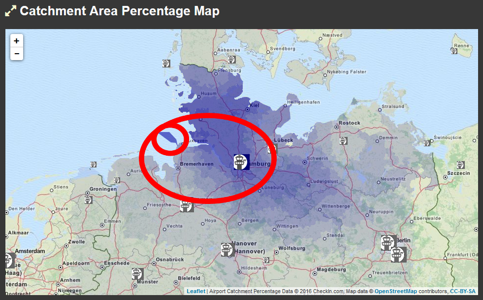
Around Lugano, we found many municipalities being located in the alps, with a town, and a lot of mountain with ski slopes. Unfortunately, without a defined city center, drive times differed substantially between a drive to the next municipalities city center defined and the one undefined. Having covered those, Lugano remains an “interesting map”, as there are also several municipalities with “exclaves”, split into different parts surrounded by other municipalities. But we can color only the complete one. So parts are in one drive time zone, others are in the next. Look at Locarno, where there is no admin center, but the centroid ended in the middle of the lake…
Helgoland has an airport, but the entire island is banned for cars. No drive times ツ
Population + Maps
And don’t underestimate that the population for all those municipalities we have on file are notthe same coming from Eurostat, national statistics offices or the towns themselves. The naming differs between those sources and there is no “common code” like we have in aviation, to uniquely identify those towns. That likely also being the cause of the +20% mistakes when using that commercial maps provider (€32K) for drive time calculations that caused us that ad hoc map change earlier this year. Little town Münster, Bavaria is not the large city Münster in Northrhine-Westphalia the commercial mapping provider returned. And is that now Münster, Bayern or Munster, Bavaria or Muenster (Lech)? Worse in France I can tell you… So we had to make sure we only use geopoints and not unreliable “names” and maintain an extensive list of “associations” to make sure we have the data properly associated – until the next update when they changed a lot again.
But worse; you can’t use Eurostat everywhere, even within the EU. With their data being outdated the day they publish them or regions like Scotland using a totally different and incompatible data model, so they publish “calculated estimates” for the wards. More guesstimates than estimates. And Europe only covers just 28 states anyway, the entire Balkan is missing, Norway, as well as most the microstates … Are the Aland Islands independent or part of Finland? Those are just examples.
And then we need to associate cartography data from the cadastre offices that is incompatible on the same year to their (own) national statistics and Eurostat. So that also goes into the number crunching. Do this for one airport is bad enough. Do it for Europe? We wouldn’t try that stunt again, now we know what we had to go through… And no, the commercial “solutions” are just as bad, so we had to do it “again” for our own database. So we use OpenStreetMap for the mapping. But for our layers, we compiled our own database of administrative boundaries, meanwhile mostly from national cadastre offices with own updates to make the maps match the population data.
Other variables
So we take into account the airport size by passengers, defining (assuming) the “reach” of the airport. That’s also something variable, as in some areas there’s a lot of large airports (i.e. Germany to BeNeLux), other regions, airports are rather scarce. Spain for example has Madrid in the center and except for two minor airports all other airports are on the coast. To Bucharest a substantial number of people drive eight hours. We calculate ferry times, including standard waiting times, but what about ferries that go once a day and then you have 18 hours to wait for next days (once-daily) flight?
As I keep saying: Despite all the data we provide on flown passengers on that or similar routes, on passenger potential in the catchment area, etc., I disagree with the recent statement by Marc Gordien on his very good article on air service forecasting maths. To look into the future was, is and will be a look in the Crystal Ball. We can only minimize the risk for failure by providing (and using) the best possible data to justify our gut feeling. But considering myself a professional; when I see new bases opened by easyJet, Wizz or other airlines, I frequently find myself at a loss, would have never seen fit to justify the risk. Still, many of those routes work.
It gives reasons to consider the soft factors. Reputation. Ticket prices (and ancillary revenues). Frequency. Ethnicity. Commercial relations. Tourism. And many others. And my commonly used example where a regional airline opened up a route on a trice weekly basis, only just when they started making money to be cannibalized by a low cost carrier with bigger aircraft and less frequency, dumping the route in less than a year. Unfortunately, the regional carrier was gone, the route is no longer served. Data is not everything. But it helps to qualify the real cases and make sure you understand the risk taken on new routes.
Quo Vadis?
Do you find something “weird” on our maps? Please let us know! There are still many mistakes and bugs and we constantly work on the database to improve the information we have. But we believe we now have a rather well working system, the bugs our users point us too are mostly either quickly corrected or (mostly) resulting from reasons beyond our control. And the results very nicely match the facts we get from other sound sources from airlines and airports to compare our results with.
We also work very hard trying to simplify our analyses, compile meaningful facts in the dashboard and provide the more complex detail on the analysis page. We discuss options to also interface the data with other tools, though currently, most of the established companies prefer to live in their silos ツ
brilliant, big (crystal) balls
Working with (sound) assumptions, the numbers help you to understand and qualify the potential and the risk, but there are exceptions, no matter how many work on the data to improve it. It will remain an ongoing development and ample room for improvements. And such we will gain better and better understanding of the facts. But we can’t read the minds of the decision makers: The paying passengers. We can only assume a likeliness from sound statistical analyses.
We do not replace a route analyst or airline network planner. But we polish the Crystal Ball(s) in use and provide real nicely shining and new ones to take a better look. Check it out.
While “the world” meets at World Routes, we received inquiries, why CheckIn.com is not there.
Sure, there are “obvious” reasons, but when it boils down, you need to prioritize where your money comes from. So while World Routes is an important event, I believe in the reasoning behind the split into multiple Routes events.
World Routes for the global players, regional routes for the regional players. Whereas at Routes Europe earlier this year, the “regional focus” is blurred already, attracting “foreign” long-haul airlines. As CheckIn.com currently focuses on Europe, Routes Europe is a must go for us. So we will be in Ireland next April. As an airline client requested Russia before North America, we won’t be ready for Routes Americas in Vegas in February.
If we get North America up in time, it may make sense to look at World Routes 2017. May make sense.
Likely still not, as the focus of the event is the networking between airlines and airports. As close as we are related to the aviation network development industry, we are secondary, we are supplier. World Routes is simply too busy, too packed, to give us a lot of opportunity to promote our services. That’s much more focused and such reasonable at the smaller (and targeted) events.
Right after Routes Americas, there’s the second (annually first) European event which we now have as a “must go” on the agenda: Connect°
Which motivated the question, why or how that event differs from Routes Europe and why I believe this is even more valuable…? The answer is rather easy. Where Routes attracts all those big shots, it is already becoming a “major player event”. Many small airports and airlines expressed towards us that they feel uncomfortable at Routes, even on the Routes Europe. Too big. Too big-focused.
Connect° and Karin Butot focus the event to the small and mid-sized players. So if you look for big traffic and big routes, go to Belfast. But if you focus on small airports, regional airlines and more local business, you’re very likely better off at Connect°.
So if you want to meet us…
22.-24. Feb 2017: Connect°, Ajaccio, Corsica, France
23.-25. Apr 2017: Routes Europe, Belfast, Ireland
Or call us to make an appointment elsewhere.
P.S.: Have you registered for CheckIn.com access? Registered users enjoy free access to basic airport data for more than 570 airports in Europe, including an isochrones map and the population in it! Free as in “no charge” and “free to use” (as is).
After my bad experience with the accesses to “articles” on LinkedIn (versus own blog), where LinkedIn reaches around 80 unique visitors in a week and then dead silence, compared to 300-400 unique visitors on the blogs also on the older articles… We’ve just run a campaign on LinkedIn focused to special interest groups to promote the package with TIAS. It’s quite a proof how much more worth it is to attend conferences and meet and speak to people. I expected to be “out of budget” within max a week… Six weeks later, it still runs.
Should you have questions or want me to give you the presentation online in English, just give me a call ツ
This website uses only standard Wordpress cookies, not used for any analysis. We'll assume you're ok with this, but you can opt-out if you wish. AcceptRejectRead More
Privacy & Cookies Policy
Privacy Overview
This website uses cookies to improve your experience while you navigate through the website. Out of these, the cookies that are categorized as necessary are stored on your browser as they are essential for the working of basic functionalities of the website. We also use third-party cookies that help us analyze and understand how you use this website. These cookies will be stored in your browser only with your consent. You also have the option to opt-out of these cookies. But opting out of some of these cookies may affect your browsing experience.
Necessary cookies are absolutely essential for the website to function properly. This category only includes cookies that ensures basic functionalities and security features of the website. These cookies do not store any personal information.
Any cookies that may not be particularly necessary for the website to function and is used specifically to collect user personal data via analytics, ads, other embedded contents are termed as non-necessary cookies. It is mandatory to procure user consent prior to running these cookies on your website.
 First Webpage 1994 (thanks to Oliver Dietzel). First own domain (CheckIn.com) 1995. First commercial Internet travel bookings (ab)using Amadeus 1996 (Siemens Travel Net/Cytric). Honorary Member of the Editorial Board for ITB Travel Technology Congress 1999-2002. Exclusive speaker at the first ever ACTE event (a three-city roadshow) in Germany 2001.

![“Our Heads Are Round so our Thoughts Can Change Direction” [Francis Picabia]](https://foodforthought.barthel.eu/wp-content/uploads/2021/10/Picabia-Francis-Round-Heads.jpg)
 The last weeks were rather challenging. Speaking at Passenger Terminal Expo on Data Silos, Silo Thinking and the need to Tear Down the Walls, Yulia and I also worked on the update of the airport passenger statistics, adding movements to the database to expand our information. And we fell right back into
 ANNA.aero maintains what they call the
 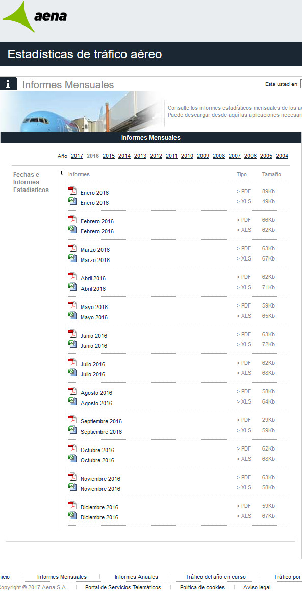 We find several sources for public accessible data. Sometimes you find it on the airport’s own website, somewhere in “Statistics”, sometimes in a press release, usually not in one, but in 12 press releases (see image). And even when publishing the annual numbers in one file, the file comes as a PDF, formatted that they cannot be extracted into a table but copy into one value a line. On a complex table, that renders that useless. So the airport forces users of their data to write the data off the PDF? You can’t be serious, can you?? Sometimes national airport associations publish the data, usually monthly. After we found them to occasionally change the formatting and order even within a given year, we double-check that on the import, burning valuable time. Then we learned to now download monthly data before the annual one was available, as we also happened to fall the trap of intermittent changes (see ANNA.aero). Many such files do not contain the airport codes. But the airport name in the national language. Upper case. No, that does not compute easily and is prone to cause data errors.


 Mark from OAG directed my attention this week on OAG’s Punctuality League, which they offer for free
  It can only be an indicator, as both sources fail to relate the one to the other. My first question would be to correlate the on-time performance to the hub airlines. Because it is utterly unfair to blame an airport, if their major hub airline is notoriously late.
 Yes, for CheckIn.com we emphasize that all that data can only be indicators. To be interpreted by an experienced network planner. Because a single new flight makes a major impact on a new or small airport, but has little statistical relevance on a major hub. Saying that, isochrones are in itself valuable statistical data and we put them into our analyses for a reason. As they are a necessity in comparison with the catchment area analysis to interpret the possible impact for a route. In forecasting, you work with indicators, you have no facts.
 At the same time you work with big data, so the more data you work with, the more vital it is to get them from a sound source and have them integrated into a common system. Whereas most established data providers, be it OAG, Flight Stats, SITA, etc. have not yet addressed that for a “good reason”. But as an industry, it is vital we add this and integration is very high on our back log at CheckIn.com of what we where we want to go!
 So. Why do I give these on-time-performance, no those delay statistics so much thought? Aside the cost of delays summing up to millions, they are not just a nuisance, but a problem. Because when I did that additional case study on cost savings, based on the
  LinkedIn Ban in Russia
 LinkedIn CheckIn.com Group

 The Isochrones People


 Another bug we have in our backlog and work on constantly (it’s “relax work”) are the city centers. We calculate population based on the municipality. Now municipality borders are nothing really easy to use for mapping. Take the example of
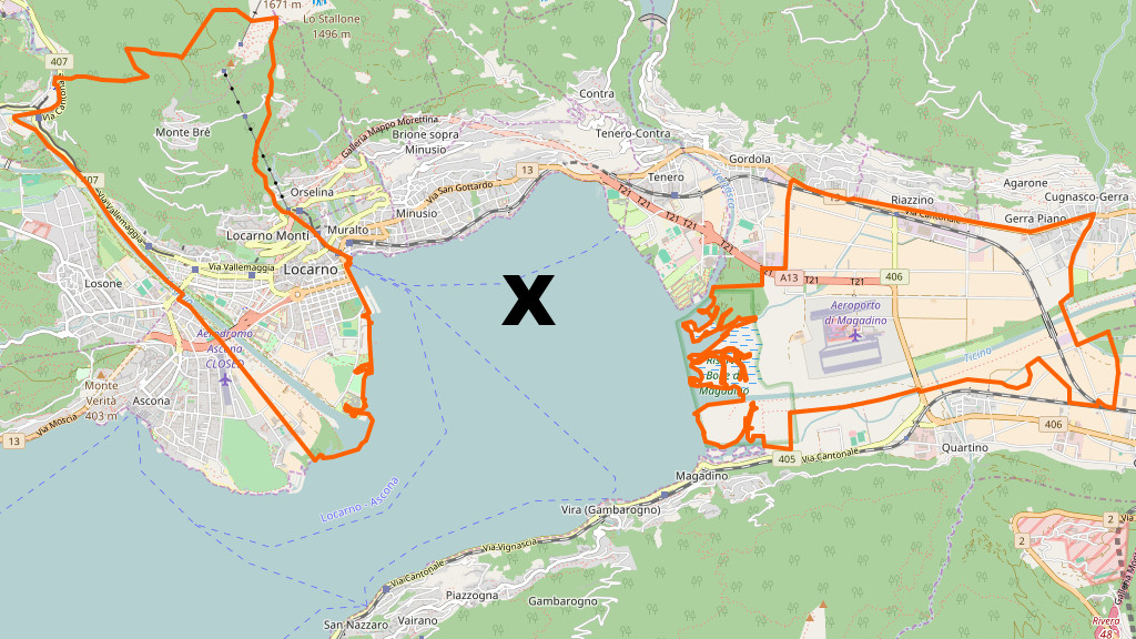
 And don’t underestimate that the population for all those municipalities we have on file are not the same coming from Eurostat, national statistics offices or the towns themselves. The naming differs between those sources and there is no “common code” like we have in aviation, to uniquely identify those towns. That likely also being the cause of the +20% mistakes when using that commercial maps provider (€32K) for drive time calculations that caused us that ad hoc map change earlier this year. Little town Münster, Bavaria is not the large city Münster in Northrhine-Westphalia the commercial mapping provider returned. And is that now Münster, Bayern or Munster, Bavaria or Muenster (Lech)? Worse in France I can tell you… So we had to make sure we only use geopoints and not unreliable “names” and maintain an extensive list of “associations” to make sure we have the data properly associated – until the next update when they changed a lot again.
 So we take into account the airport size by passengers, defining (assuming) the “reach” of the airport. That’s also something variable, as in some areas there’s a lot of large airports (i.e. Germany to BeNeLux), other regions, airports are rather scarce. Spain for example has Madrid in the center and except for two minor airports all other airports are on the coast. To Bucharest a substantial number of people drive eight hours. We calculate ferry times, including standard waiting times, but what about ferries that go once a day and then you have 18 hours to wait for next days (once-daily) flight?
 Quo Vadis?
 While “the world” meets at
 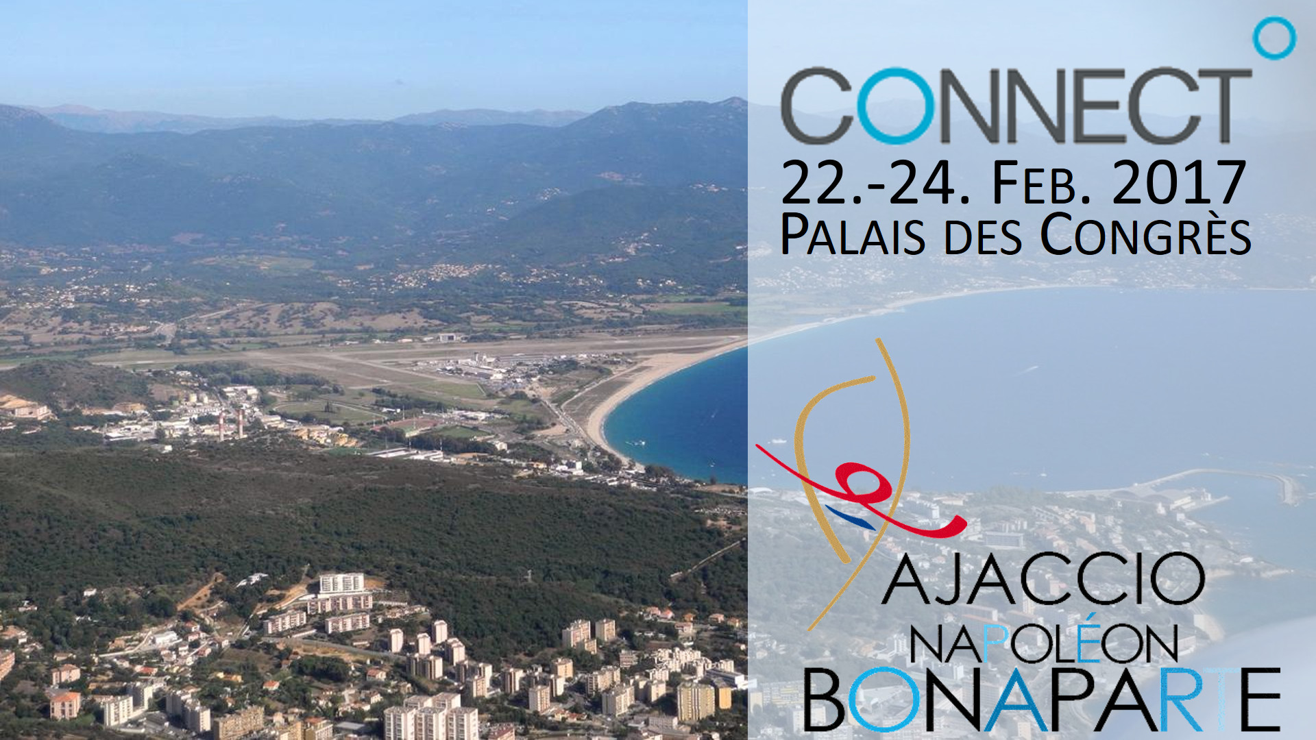 Right after Routes Americas, there’s the second (annually first) European event which we now have as a “must go” on the agenda: